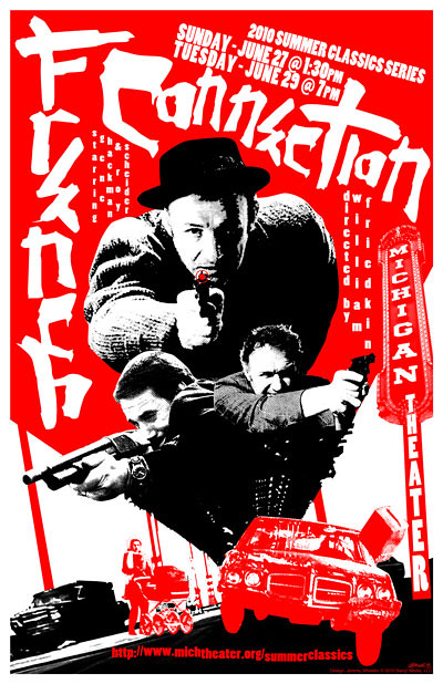
French Connection Japanese-Style Poster!
Heyya kidz!
So I love me some Japanese movie posters. In fact, I’m kind of an armchair fanatic. You know, not to the obsessive point that I blow dough on the collector’s market, but just intense enough that I’ve got a whole load of books and computer files full of wildly designed Asian poster goodness.
Now I’ve done an ode to Japanese posters before. I’m my own big fan of this SuperBang! poster, using a sweet image from Chip Kidd’s super Batmanga book as a starting point. 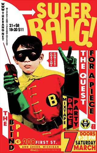
But now that I’m starting off a Summer Classics Series for the Michigan Theater, I really wanted to harness that aesthetic again for William Friedkin’s 1971 acclaimed cop action drama, The French Connection. My original inspiration was this killer Bullit poster my man Christian sent to me…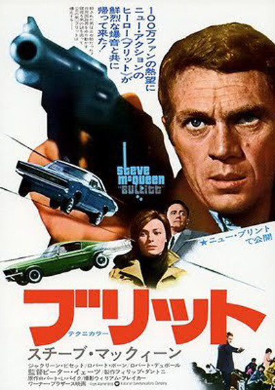
LOVE that poster! Check out all those dynamic angles, with every piece of the design - from the text to the images - all working to give yer eye a seriously pleasing workout. Now I have found a real-deal Japanese French Connection poster, and it’s great. Once again, you have dynamic angles all guiding yer eye to Mean Gene Hackman. Also — those colors are fantastic.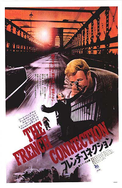
I couldn’t help noticing, however, that as I poured through all of the film’s ad art, it was really hard to get away from that iconic stairwell image. 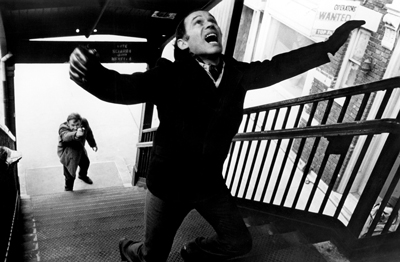
So right off the bat, I knew I wouldn’t even bother with that. Someday it’d be fun to screw with it, just to see if it could be switched up to seem fresh, but this wasn’t the time.
So along with that poster above, I had a few other posteriffic inspirations that helped keep the creative juices flowing. From Sonny Chiba to Peter Fonda to even Snake Plissken. Check ‘em out and wonder why we don’t have anything nearly as dynamic gracing our advertising these days.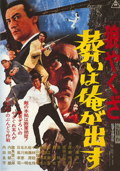
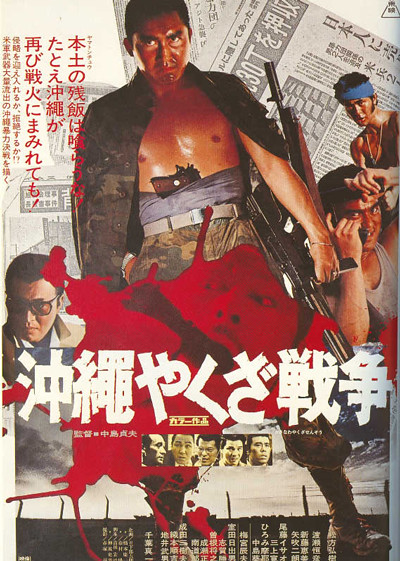
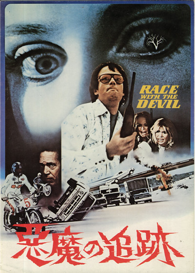
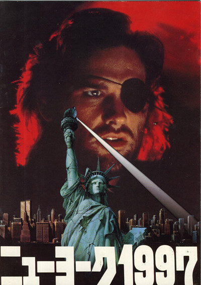
What I really love is the freedom of the design. That Race With the Devil poster is incredible — and EVEN BETTER if you’ve seen the movie. Come on, that tree in the eyeball? Amazing contextual stuff. Plus it’s got shotguns, motorcycles & all sorts of vehicular madness, which appeals to my inner man animal. And that Escape From New York? What’s up with that spotlight? I dunno, but I love it. The other two represent typical outrageous Japanese action poster design. Mix lots of images together + throw images inside of other images (the face+gun inside the blood splatter) — and make that shit pop! And once again, we have those dynamic angles. It’s like the posters are leaning, yet grounded by the prominent horizonal+vertical type.
I had a few more inspirations, but a lot of them were for pink films. Believe you and me, there’s a LOT of smutty Japanese poster designs that all share the same aggressive aesthetics, but almost always feature a whole lotta flesh.
But maybe I’ve typed too much? This was, after all, a post about my new French Connection poster. Yet I really wanted to give people some insight into the world of Japanese movie art — or at least, the kind of stuff I dig on. As for my poster, I’m looking to have them silkscreened, as well as blowing at least one up to 27x40 in time for the Michigan Theater’s shows. More on that to come. For now, enjoy my newest baby. Feel free to click on it and check it out in huge-o-vision. 